Revision Plan for the Documentary

Image

Revision Plan:

1.) Add all necessary assets from before

2.) Add two more assets

3.) Add more information

4.) Make sure everything is properly cited

5.) Take pictures along the way to document production –add description–

6.) Document how to use the website


For the first part of editing the website towards making it the final documentary is adding all of the assets I have previously made. Beyond what I already have, I believe that I need to add one more photo and the audio to the website. This should be a fairly simple task that just involves uploading the objects.


For the second part, I need to add two more assets. For these two assets I will most likely edit two more photos. Photos have the capability to enhance the information without being distracting. A video or more audio could distract the audience and would not be quick chunks of information.


After that, I must add information. This is ultimately making sure my argument is complete. I need to add a little bit of information to each page to make sure all of the information is there. By doing this the information will become more credible; as well as, more efficient for the audience in terms of receiving new information.


When adding information, most of it will come from other sources. Because it is coming from other sources, it must all be cited. This includes pictures, videos, and the text. They will all be cited on their own works cited pages that are directly linked to the parent page.


The final key aspect of the final grade is the documentation of production. In order to complete this part, a few key pictures should be sufficient, all of which will have some annotations on them. These pictures will show me using the difference programs and editing my assets that ultimately end up on the website.


Finally, the last key piece of documentation is the usability of the website. For this part I will show how the audience is intended to key the information from my perspective. This will most likely be a video, but could end up like a comic strip. Whichever one comes to me on the day I decide to complete this part of the website.

Designing The Site

Image


Argument

What argument is your site making?

The site is going to be discussing how football has changed since it was introduced, including how the equipment has changed. This will then make the argument that there has been a domino effect of rules following the changes in equipment.

To who?

My argument will be mainly towards those interested in football or those who are curious about the safety precautions of football. This aspect could apply to those who want to know the rule, develop an opinion on the rule, learn more about the reasonings, or even what are possible effects of football.

What appeals will be most effective given your audience and purpose?

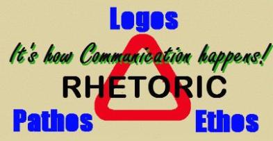
I believe that the logical appeals and the emotional appeals with definitely be the most effective. Logical in the sense of explaining why these things are happening, and emotional in the sense of what is happening and what it could lead to.

How will you translate those appeals into your site design? Think about the sites you analyzed for today and how they did those things.

In my site design I do not want to do anything too fancy. It is best to make the site simple to use for the audience; as well as, keep the information accessible. In order to aid my words, pictures will be very important to help portray my argument.

Architecture:

Navigation:

My navigation will be focused on the left. It is best to keep it in one location for the duration of the website, and having it on the left is very noticeable. There will be five basic links that lead the audience directly to one the page, no matter where they are.

Layout:

Throughout most of my website the layout will remain relatively the same. Titles on top, navigation on left, contact info on the bottom, and the content/pictures on middle/right. On the homepage they will be split, but on the individual pages the pictures will be within the content. It is a good idea to keep the content relatively the same on every page so the layout does not become distracting. However, having the pictures within the info on the actual pages increases the likelihood that the audience will make a connection with that bit of information.

Content:

On the homepage, the information should be generalized. An introduction to the site, but nothing too lengthy. Once the audience branches to one of the four categories there will be more information visible because it is a topic of interest and is meant to be the bulk of the argument. On the homepage is meant to act like an opening paragraph, so to say, and it should not be nearly as long as the body paragraphs.

Aesthetics:

Overall, my design will not be eye popping and colorful. The layout does not need to be flashy or it may distract from the real information. If the pictures are the most colorful things on the page, the eye will instantly be drawn to it and quickly retrieve the message.

Group 5: Site Structure

HTML is all about being able to distinguish between the structure and the visual presentation of the website. This content and structure becomes semantic when it is able to convey meaning. Also, a key to good coding is to be efficient, meaning that the display has much flexibility as possible and has universal flexibility when crossing over between different devices. This factor has two vital parts; with the audience and with the developers. Being able to have everything organized for the reader is as important as having the coding labeled properly so it is easily accessible to go back and rewrite it later on.


Using HTML is about getting the most that a user can get while using a minimal amount of code, but with the flexibility to later use the code for purposes not originally thought of when it was first written.  In a properly formatted HTML, the code in the web page should be within a head and a body.  The head declares what type of page it will be to the displaying device, while the body contains all of the page content that will be displayed.  Cascading Style Sheets allow web designers to use the information provided by the HTML to present their own unique visual on the site.  Unfortunately, different browsers and display products can result in a change in the look of the website if the HTML does not compensate for it.


Organized site and page structure leads to greatest understanding, flexibility, accessibility, search optimization, and future growth and change. Its important to have a consistent naming system when developing your site so that everyone on the team is on the same page. Naming files with clear, unique names helps to encourage understanding and also make the job of the designer easier.


Site structure affects the overall success of a site in a broader context of the web. The methods used to construct the site can have a great impact on the site’s ability to grow and expand globally.  The content portions of the web pages should be subdivided by divisions and spans that label functional areas of the page.  Naming these divisions and spans helps with style sheet control, allows for application of CSS more easily, and also will give you a wider range of options in the future.  Proper semantic naming is easy to do in the beginning and near impossible to do towards the end.


Rhetorical Analysis

Image


To keep things simple, I decided to go to http://www.doclab.org/category/projects/ to acquire my digital documentary examples. I am sure I could have gone elsewhere to find cites that better suit my topic, but I felt like I couldn’t go wrong looking up some good examples from a link previously given in class. 

http://www.wefeelfine.org/wefeelfine_mac.html

For the first analysis, I used the very bottom cite, titled “We feel fine.” The launch page provides a good example of what to expect before the documentary has even been launched. The color scheme is black and pink, which would most likely attract a female crowd. Furthermore, there is a heart on the left with the title, and a supporting sentence on the right stating, “An exploration of human emotion, in six movements” and directly below is the link to the documentary. Overall, this page does a nice job of welcoming the audience in and telling the audience that is about emotions of people, and there will most likely be six categories. The page is spread out well and is informative for being so simple. Once the website is entered, the color scheme continues (which is a good thing so it is not a distraction) and there are, in fact, six categories at the top. Of these categories, they are extremely straight forward. This is a good strategy to use for the audience so they do not get lost in the cite, and they can easily access what they want. Before choosing any of the categories, which are drop down menus, there is madness on the screen of random dots going all over. If a dot is clicked it is possible to see an emotion of somebody. From here, the audience has a bunch of choices, and is a very beneficial approach. The audience can then choose if they want madness or some other style of information, and they can decide how much information or what information they want exactly from the drop down boxes. Overall, the cite is pretty good and not a bad thing to model; however, there are no visuals, the color scheme may be too limited, and the information is slightly too narrow. If I was to base my documentary around this I would definitely change a few things.

http://www.happy-world.com/en/

For the second analysis, I decided to do the “Happy World” one. Overall, this one looks cleaner than the last and is really appealing to the audience. The layout is simple, a maroonish color scheme, video in the middle, info on the bottom, title at top left, and options in top right. This distinct layout allows most audience retrieve all of the information they would want from the cite right there, and if they want something else the links are direct and accessible from the home page. For example, if the audience would want more information on the content, they could click the bonus section, or if they want the authors information, they could click on the about section. Furthermore, if the audience does ever venture off, the most useful feature is the title. The title allows for immediate homepage link from anywhere, this prevents the viewers from accidentally getting lost. Typically speaking, I would not mind basing my project off of this one. It is very clean, eye catching, and interesting with the fonts and characters. The creator of this documentary did a very nice job. 

http://www.nationalparksproject.ca/#

For the third and final analysis, I decided to look at the “National Parks Project”. Compared to the other two I have analyzed this one is way more colorful and complex. When I say complex, it is almost TOO much. This website loads up with a quote about the parks and continues this trend when anything loads. Overall this is a good idea and is a good way too keep the audiences attention even when information is not meant to be on the screen. After the loading screen, there is a menu at the top that you must move all the way to the top to pull down. From there you can then click a category to get deeper. This is a good idea and a bad idea. It is a good idea because it essentially hides the categories when the audience does not want to focus on it; however, it is distracting and not as easy to navigate when navigation is desired. At that point, the most popular of the categories will be the exploring the parks. The users must click on the category, and then a compass appears on the screen and the audience must scroll over to find the part they want. While this may look cool, it is a pain to navigate. It is not direct, words are upside down and it is a pain. This pattern follows with the rest of the categories and it is not an effective method to choose. With that being said, the background of the documentary is always a video of the parks. To me, this is a very good way to display the parks. Visuals stimulate the audience and could really draw them in. As a whole, this documentary is good but there is too much too it. Complicating things is not always the best strategy.

In conclusion, the first one was not complex enough and the third was too complex. When making my project I would try to focus somewhere between the second and third ones. By doing this the audiences will be drawn in with enough visuals, while maintaining a simplistic design that is easy to navigate. After analyzing these I am anxious to see what I will be able to come up with in the coming weeks.

Football Video Project

Image

After reading the assignment sheet I am slightly more excited for this project than I was before. Considering the main point of my argument is a compare / contrast over time, it will be very easy and entertaining to do a trailer type of thing. Obviously to help prove my point, the major aspects of the game will be exaggerated slightly, but I will interpret the older style of play in a very cheesy way. This will symbolize to the audience how slow and different the game was then. I will be able to use effects to make it look older and some sound effects to press the stereotypical old corniness. Then I will lead to a developing question of how football changed over time or what changed football over time, whichever fits the video better. This will essentially be the turning point in the trailer. Similar to a transition from recapping a prequel, leading to the sequel. After that will be the sarcastic pitch of NEW equipment that leads to BIGGER hits, FASTER play, and MORE injuries. The video will then up talk the NEWER / BIGGER / FASTER / MORE that draws people in, while showing why all of these things are actually bad. Ideally, this exaggeration of making the “bad” aspects of the game sound “really good” should initiate something that connects to the readers senses. It should be a relatively effective approach that is appealing to the audience. It will be very logical and should persuade the audience the way I want. 

Evolution of NFL Football (& The Equipment)

ImageImage

As I have previously stated, I would like to do my project on how football has changed with the changing of the equipment. By comparing either set of pictures (above or below) it is easy to see several differences over time. In the older pictures, there is clearly far less equipment, more vertical stances (i.e. slower movement), and ultimately less contact. In the newer pictures, the equipment is much more advanced, more of it, not as stiff, and ultimately more contact. Despite being still pictures, they do depict how the game has evolved. In the old photographs there is very little contact. In the picture below the line really is not blocking, yet nobody is “rushing” the quarterback. They are simply putting their hands up. In the picture above, the form of blocking is simply building a wall to stay behind. It is less about speed and physicality and more about strategy. Without the helmets, there is not any “battles” at the line of scrimmage and less trying to smash the opponents. Over time, equipment was developed to better protect the players; such as, full helmets, shoulder pads, and other types of pads. The purpose of my DMP will be to show how the game has changed and prove that it was the equipment that changed it. With these new pictures, you can see more physical hits and more care free tackling. In the picture above, the defender is diving to tackle, and not even using his hands. He is leading with his head down, which could cause a serious head/spinal injury. This type of tackling has increased as the years have gone on. The advanced equipment gives a false sense of security to the players, which then increases the injuries due to recklessness. In the picture below, the player sacrificed his body going up for the ball and was leveled in the air. This could result in injury very easily. It is clear that football has became more physical nowadays, and has only been reinforced with new equipment that was meant to “protect”. It promotes playing harder. In the older days, players played a different way, because they had to. After comparing the different eras of football, it should be clear to the audience the ways the game has changed. The images logically depict the change, but the equipment is the underlying cause. A brief process of thought may be required to conclude that, but it is there. Although these four pictures are all rhetorically effective for my topic, they are not easy to find with a C.C. license, and really are not the best of examples. I could not find any more “high quality” pictures beyond these four, so they will most certainly will be used in some way by me, but hopefully I can manage to find more.

ImageImage

I Believe in Sports


Image


Bumper: I believe in sports

Intro From Andrew: Cory is a first year student, who is a Chemistry major. He has five sisters, whom are always at the softball field, but love all sports. They participate in softball, basketball, volleyball, and karate. Here is Cory.

Story: I believe in sports. Sports are an important thing in this world. They are forms of entertainment, recreational activities, and competition. My family is big into sports, especially football, baseball, basketball, and softball. No matter what season it is, my family is participating in something. But to one member in my family, they are more than of the things previously mentioned. To my sister, Colbie, they are both an escape and a therapy. Colbie is almost four years old and she was born with cerebral palsy and cannot move her right side of her body that effectively. When she moves around there is always a limp, and when she goes to use her right arm there are delayed reactions and ultimately a lack of control. However, when my sisters are playing softball, and Colbie wants to participate, her handicap seemingly disappears.  On the field, she does not show that she is handicapped at all and she has the biggest smile on her face. Sure, she still has slight issues with her right side, but she still manages to outperform all others her age. She grabs the bat with two hands, swings, and puts the bat on the ball. When she catches and throws she has to use her left hand for both, but with time she will change that. With the availability to play softball all of the time, she is constantly undergoing extensive therapy and she does not even know it. This exposure will overtime allow for her right side to be fully functional. While sports may seem like just an everyday activity to most, they are not. Therefore, sports are once again a good source of keeping her mind off her problem, as well as, helping her. Without all of the sports that she tries playing, who knows how effective her right side would be right now. I believe in sports.

Relevance: This will be relevant to my documentary about the evolution of football, because football is a sport. Despite my sister playing other sports to keep her mind busy, if we are playing catch with a football, she more than willingly jumps in to catch and throw the football. Therefore, the idea of sports in general relates back to my topic.

Evolution of Football

Image

For my digital documentary I am planning on exploring the evolution of NFL football with its equipment. By this I mean that I will show how equipment and uniforms have changed and how these changes have altered the style of play. I will argue how football was once a tough sport, with little equipment, where players lined up across from each other and the better team won, but now it is a sport with too much equipment that has had opposite results, where players are getting hurt more frequently. Because of my topic, I plan on creating an evolving style of the documentary, if possible. Maybe have the first part of the DMP be more straightforward and only give the audience small choices, while by the end have the audience to be in complete control of what they view. This structure will “mirror” the evolution of football. The majority of offense in the early years contained pounding the rock and small ball; however, as time went on it became more of a quarterbacks game. They can pass and have complete control. Furthermore, I plan on using as many pictures, clips, quotes, and audio as possible. With a topic like this, physically showing the changes will do way more than words would. Words could only attempt to tell about the changes, but it would not put a picture into the audiences heads. Also, with quotes, there will be an added depth of understanding what players thought of the equipment. Finally, the audio with make the structure seem even more realistic. It will create the “atmosphere” of a football game, to go with the pictures and navigation options. While these are a good start to the DMP, only time will tell what I manage to keep and what I decide to add.

Here At Home: Summary

Image

http://athome.nfb.ca/#/athome/home

Obviously, throughout much of North America, homelessness is a serious issue. Studies have been done to show that the average homeless person takes about $40,000 worth of services per year. Those that require medical aid as well take up about $97,000. Considering these people tend to continue this need year after year, some alternative aid needed to be construed. So in 2008, the Canadian government granted $110 million for a radical experiment of housing to be carried out. If you were homeless because of addiction, you must get clean and you get a house. If you have a mental illness, you get a house then you get treatment. Within this experiment of nearly 2000 homeless people, a little over half were provided with housing as long as they paid a third of their annual income, while the rest stayed on the normal treatment. After four years of data, a large percent is showing positive results. The average cost of aid is slightly higher than the homeless aid average, however it is taking people off the street. Furthermore, for those that are high users of medical treatment, it is about $20,000 cheaper per person for those that were provided housing. While it was deemed successful, it is still very expensive and would require much investment no matter where it spreads. This particular study was only in five Canadian cities (Toronto, Montreal, Vancouver, Winnipeg, and Moncton), but they would like to expand it throughout the country coast to coast. Only time will tell if it is able to spread any farther than that.


Blog Prompt #1

Image

The documentary “Hollow”, about McDowell County, WV, uses several devices, or modes, to really entice the viewer. Some of these modes include images, audio, and video. These images are really able to depict the gritty downfall that the county had. It went from a prosperous, good place to be, to being a bad environment involving crime and drugs. On top of the images, there is an incessant audio of the town in the background. This audio essentially allows the viewer to feel as if they are there in McDowell. Together the audio and images are known as multi modality and have a better effect on the audience. It increases the odds of getting the point across about how bad the area is. The other mode that was used were the videos. These are arguably the best modes because they combine everything and allow a purposeful meaning to be easily told to the viewer. Some of these examples came from the guy tap dancing and the couple that was always on drugs. However, overall the use of the modes and semiotic resources allow for the audience to draw meaning from and understand the interactive documentary.

The two signs of the very similar story share nearly the same meaning, but actually have several differences in how they came upon that result. First of all, the news story was able to focus on interviews directly with people. They civilians would be asked their opinions, typically of the economic downfall in recent history, but did not really create any emotional attachment to them. The documentary focused on the events. It showed what led up to the downfall and used devices to surround the reader in the environment and ultimately create that attachment to the topic. In conclusion, both pieces were able to depict the recession of the county and how bad of a state it is in. However, one enticed the audience more and showed what happened, while the other simply told about it.